

A place on the Web
Rebuilding appletreeinnlenox.com

In college I briefly served on a committee of students advising the administration on its Web site. It was 2010, the heady days of the second or third wave of social media. Facebook had already “put the social experience of college online”, as The Social Network (released that year) put it. But in that movie people huddle at desks around laptops; now the iPhone had unchained them. Twitter and Foursquare thrived on your ability to post about physical spaces while you moved through them, as if the crowd was a colony of ants that had suddenly gained access to pheromones that could waft through the air. Facebook had initially represented the world in structured clauses limited to “[person] friends [person]” and then “[person] likes [post]”, but now it was expanding to represent any kind of “[subject] [verb] [object]”, such as “[person] listens to [song]”, or “[brand] recommends [product]”.
At that time it felt crazy to us that the school spent so much on buildings but so little on our Web site. The outward-facing marketing pages were uninspired, but we were more concerned with with the inward-facing services, an agglomeration of random applets and content that lacked dynamic context. The page for a class didn’t know if you were in it. I had just learned how to make a Web app backend and wanted to replace the student government with one. An app for elections, for petitions, for funding student organizations.
It was on that committee that I first heard about the phenomenon of “shipping the org chart”, first glimpsed that bureaucracies are community rituals not equivalent to any code, and first learned many other general and transferable lessons. But my favorite challenge was specific to the college context: how to make a Web site that worked in tandem with a physical place.
Students were navigating two spaces at once; couldn’t one be used for the other? You meet your neighbors upstairs in the dorm; where’s their directory entry? You walk past an athletic field with a game underway; who’s on the field? You walk to class in Searles; where’s the curriculum? You fail the class and go to your dean’s office in Moulton; where’s their suspension policy? And vice versa: you see information about an event on the screen; why can’t it point you there? Why doesn’t it know if you’re already there or not? The Web has the power to abolish distance, but does it not have the power to respect it?
It was a time of high modernism, “characterized by an unfaltering confidence in science and technology as means to reorder the social and natural world”. Social media heralded a vision of software as being, like Le Corbusier’s houses, a machine for living; we felt we had to imagine how it could change the campus before others did and our school became irrelevant. But the committee didn’t get anything done, and I fell so far behind on coursework that semester that, after many visits to Dean Levy’s office in Moulton, I was indeed suspended — at which point it began to feel less important that her physical administrative office was not somehow more intimately connected to its Web site. Today, the architectural ambition of social media seems to have collapsed to a kind of portable, personalized, interactive television. Instead of the pretense that everybody is posting for everybody, the landscape has been de-democratized and re-stratified into a few active creators and many passive consumers. The revolution is in video content, not in the architecture of new kinds of “space”, and this new media — while often educational — is no longer held to have an inherently enlightening and liberatory power.
I can think of a few ways in which the technology for the co-navigation of physical space and hyper space has advanced. There are goggles and glasses for augmented reality or spatial computing; there is Dynamicland and Folk Computer. Gaussian splatting is picking up where Photosynth left off; Vincent Woo’s enthusiasm is especially inspiring. But in terms of mainstream computer usage, I think maybe roughly only three things have changed: (1) meetings routinely integrate video calling; (2) you can hold the Google Maps app up to a street and tap on a store and go to its Web site; (3) though QR codes were invented in 1994, now “everyone” knows how to make and scan them. The normalization of remote work — a dream since the invention of the Internet — was achieved by way of a respiratory pandemic, not by any redesign of either physical or hyper spaces.
I’m not satisfied! I once saw a map on the wall of a museum showing how traversing the galleries corresponded to traversing the art of different countries — a map mapping one physical space to a different physical space. That is what I still want. I want to navigate physical space in the normal way (no goggles), and the hyper space in the normal way (no camera), but I want to be able to look at a map showing a kind of continuous correspondence between them.
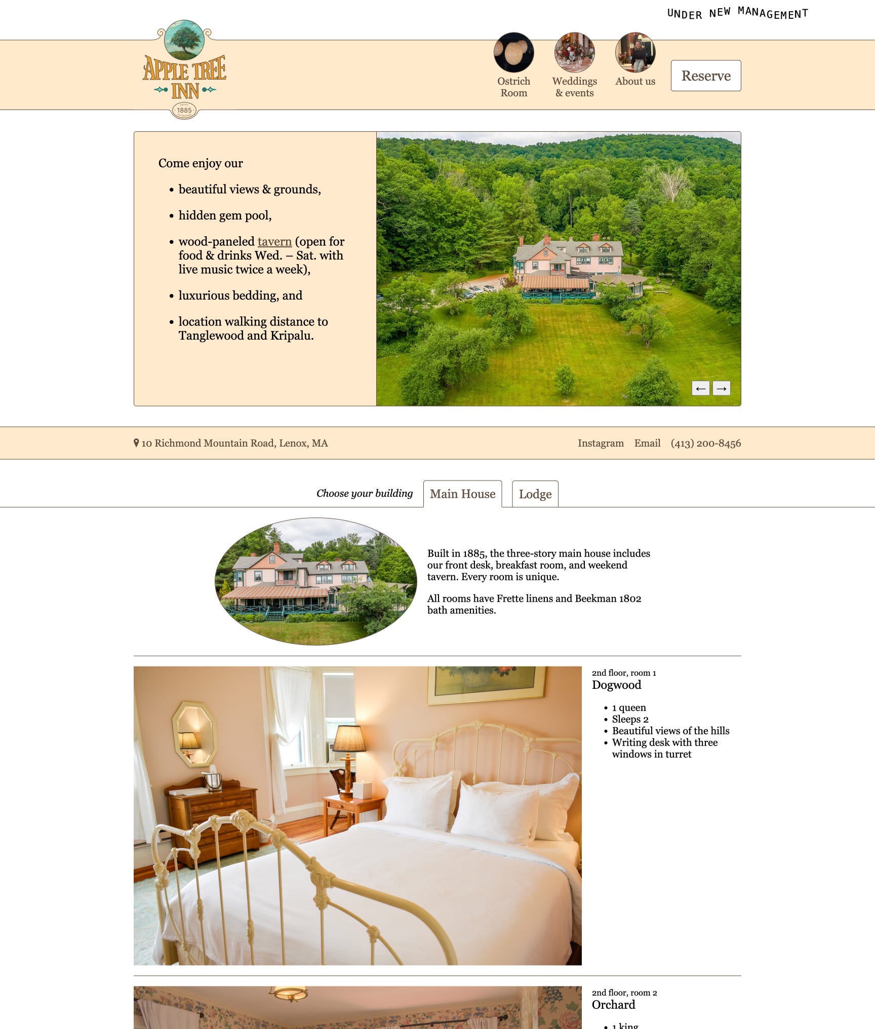
Fifteen years after that college committee, I find myself living the dream, in a position to make a Web site for a physical place. Normally I write this newsletter as a passive observer of my wife’s work; today I’m writing about my only real hotel responsibility: serving as the Webmaster of appletreeinnlenox.com. It’s so much fun to work on. And now, with skin in the game, I can say that the concept above has so far been almost entirely irrelevant.
V. minus 1: the status quo ante
Before the hotel transaction closed in April 2024, the previous owners transferred the domain to us. There was a casual Zoom call without the gravitas of the transfer of the real estate. No lawyers, no documents signed in duplicate. I was surprised the domain wasn’t held in escrow and released at the moment of closure.
This is the site we inherited:


It felt typical of the genre: full-bleed photography; parallax scrolling effects; florid language promising indulgent luxury. It felt modern, professional, and extensive. It had PDFs for the floor plan of every room; its “Explore Berkshires” section had a hundred pages for every local restaurant, hiking trail, and marijuana dispensary. I don’t remember any guests complaining about it. It seemed good to people; some friends explicitly complimented it. And so of course we couldn’t stand it.
Many of the photographs were stock. Some of them, though not taken here, at least spoke to the “ecstatic truth” of the property: a winding country road through autumn foliage; a guitar leaning against its stand. But others were not at all representative of the real place. A beautiful woman reading in a hammock, which we don’t have; a hipster couple in a modern farmhouse-style kitchen, which is not our architectural style or a space we offer to guests, passing bacon, which we don’t serve.1
The text sounded stock, too — which is too bad, because the Khaghans really did have a cool vibe going on! They had brought in DJs and bartenders they respected; they threw raucous parties late into the night, invigorating a town emerging from Covid. As I was drafting this I ran into Michael and Katherine in the park and they reminisced about how one of the favorite shows they’ve ever played was in that Ostrich Room era. It was genuinely rollicking. But the site didn’t prove it.
The site knew much more about the hotel than I did, and I was scared to touch it. Its floor plans, property map, and business listings helped me navigate my new home and town. I spelunked through its many pages, some nested deep, some outside any visible hierarchy, some deprecated or forgotten. For all I knew, any piece of it was critical to booking, or accounting, or storing newsletter subscribers.
I think the first change I made was a careful incision to clarify that some restaurant service was closed. Then Claire said one of the room pages said it could sleep more people than it actually could, and I had to figure out which WordPress plug-in was storing the bullet points of room amenities. It probably took an hour or two to change “Sleeps six people” to a “Sleeps four people”.
Two sites in a trench coat
Around May, I started to understand that we really had two sites. When you went to appletreeinnlenox.com you landed on the WordPress marketing site. Nothing you did on that site had any effect on the world outside the screen. It didn’t really do anything; it only said things. The booking buttons and forms were simply hyperlinks to a totally separate booking engine, which handled all the actual e-commerce, all the credit cards and room availability and email notifications. That one does affect the world outside the screen: it means the front desk will hand you a key if you show up on the right day with the right identification.
Ours was the structure of many institutional Web sites: an organized navigational façade that just links out to the applet that actually does the work. The two sites have branding that’s just barely consistent enough to convince you that, when you click “Book now”, you’re still on the officially intended path. It worked, but the abstraction created dissonance. There was no technical connection between the calendar on the marketing site and the calendar on the booking engine, and only the latter could show prices and availability:


Nor was there any technical connection between these two lists of rooms — and, again, only the latter could show prices and availability:


That disconnect (or loose coupling) was profoundly offensive to the “high modernist” in me. Le Corbusier, Frank Lloyd Wright, or Charles Rennie Mackintosh would design the chairs you’d sit in in the home they’d designed for you; I wanted the checkout experience to embody Claire’s vision as much as the bedspreads or dinner menu, the whole hotel a single physical–digital Gesamtkunstwork.
But of course I was grateful that we didn’t have to fabricate our own point-of-sale credit card scanner for the front desk. And, as we thought about redesigning the Web site, I was very grateful to be able to start with just the impotent piece, where I knew I wouldn’t mishandle anyone’s money. We didn’t have to touch the potent part. The dissonance was a small price to pay. The booking engine would wait.2
So, with that narrowed scope, the problems with the marketing site were:
It had a huge surface area of factual claims that we hadn’t chosen.
Its tone of voice didn’t match Claire’s.
Its level of polish implied a level of polish in service that we could not yet match.
It was hard to edit, full of unneeded plug-ins, on a stack I wouldn’t choose.
Any system you inherit feels more Byzantine than one you build. We couldn’t judge it fairly. But it was still a thrill to rip it out.
V. 1: playing it down
We relaunched the site on June 19. Judge for yourself:
At the time, it felt like this had taken forever; but, in retrospect, it was “just” two months after Claire took over. (Just in time for our first summer season.) For many friends who heard what Claire was doing and Googled it, this version was their first impression. I remember a couple of them saying things like, “Congratulations, the hotel looks beautiful! And I’m sure you can’t wait to redesign that insane ancient ’90s Web site.”3 And I thought, a-ha! Success! It’s a triumph!
I am sure my contrarian streak sometimes hurts us, in ways I realize and in ways I don’t. But it is true that this retro redesign achieved some important goals.
The previous site had implied strengths we didn’t have, and it did not suggest any of the strengths we did have: a hands-on personal touch, a folksy flexibility, a voice, an openness to learn. We had to aggressively signal that the operation was raw, barebones, and folksy. The site had to be small and blunt. We had to reduce the factual claims to only those which we could say confidently. It had bullet points about negative aspects of our rooms (steep stairs, detached bath, low ceilings). We had to under-promise so we had a chance to over-deliver.
Hosting private events and weddings had been a big part of Claire’s investment calculus, but now that she was actually operating, she was flooded by inbound interest; she couldn’t even say “no” fast enough to keep people from getting mad. The queue was saturated; she needed top-of-funnel inbound interest to back off. And that back-pressure had to back-propagate from the on-the-ground back-office to me, designing a Web site.4
Notice that Claire prioritized folksy honesty (over, say, clickthrough conversion metrics) in part because she personally bore the brunt of mismatched guest expectations by virtue of working the front desk. You probably get a different site when it’s designed by someone who doesn’t have to hear those complaints. A future “Econ 101” installment of this newsletter will cover the pros and cons of bundling and unbundling principal and agent.
From my perspective, the main benefit was switching from a WordPress site on Bluehost to a SvelteKit app on GitHub and Vercel. I didn’t care about forfeiting the “CMS” layer, because I can write content more directly and expressively in code, and I could write it faster than anything at the hotel was changing. It’s not like new rooms just show up!
But then the operation grew. Christian wanted to fix the size of a bed in a room. Abby wanted to update the private event inquiry form. The Ostrich Room got up and running, and live music restarted, and more and more of the effort went to F&B — which I learned was a much faster pace layer. Claire no longer knew everything, which meant I really didn’t.5 Sean had to update opening hours every month or two, and the menus every week or two. And Jenny had to maintain the live music listings, which sometimes had urgent updates from day to day. And then Hagai and Adi opened Báladi here, with its own hours and menus. Everyone wanted to put announcement banners at the top. And they all had to go through me!
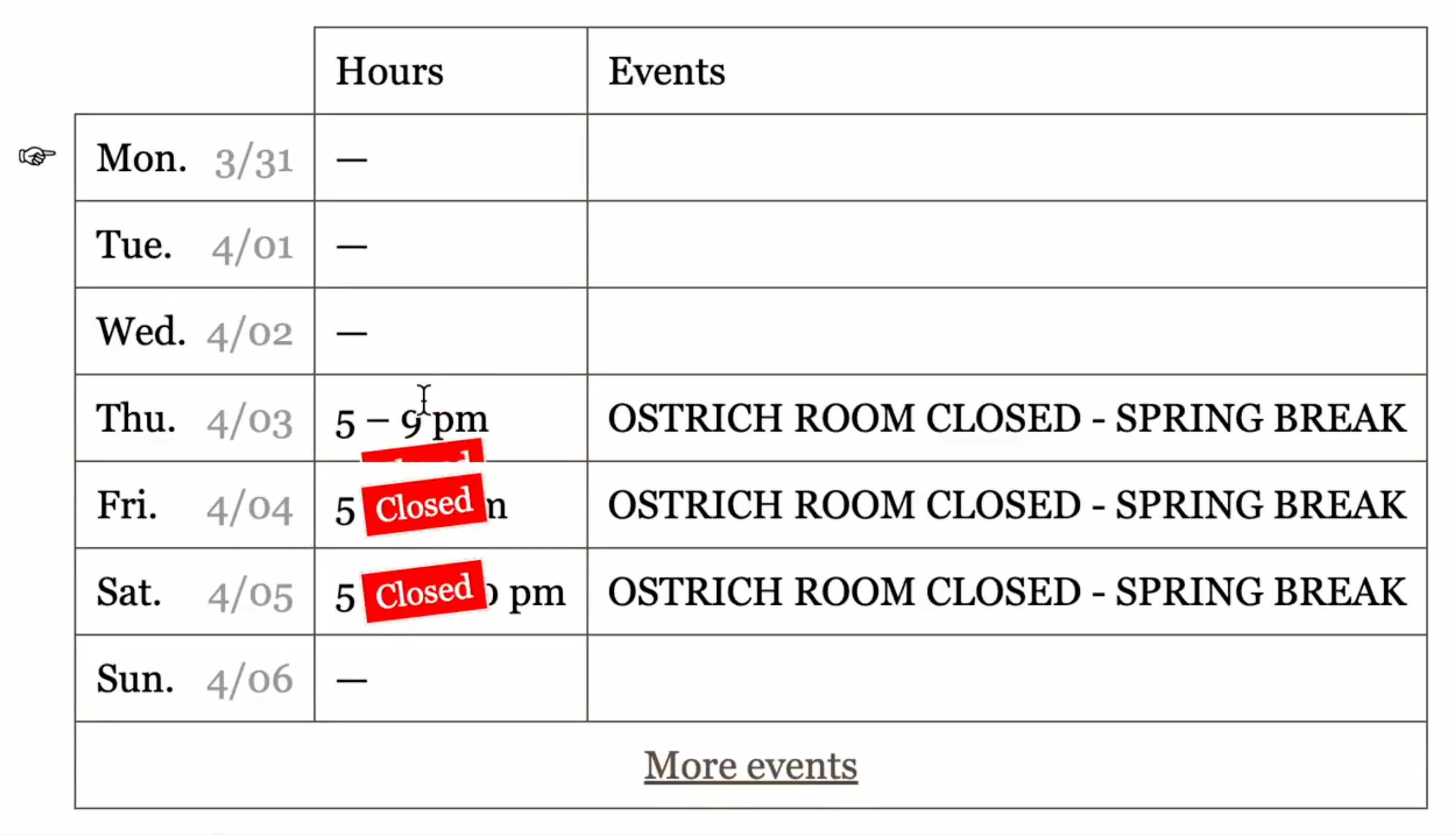
For a long time I made most of those updates manually. I added a Google Sheet for music listings. I had Sean uploading the menus to a Google Drive folder.


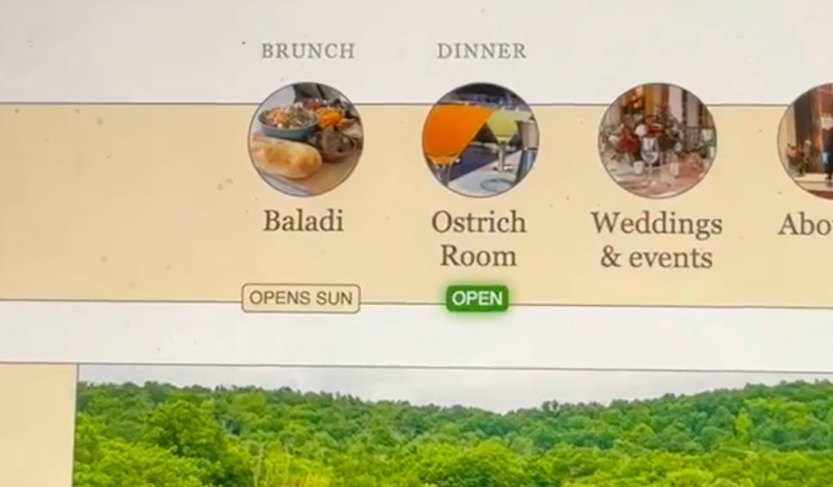
Notice, in that Google Sheet, the “OSTRICH ROOM CLOSED” items. That’s not a live musical performance! But people will use whatever channels they can edit for in-band signaling. Later, I added cute little badges to show overrides like a sticker, so you could see both the rule and the exception:
I delighted in little “signs of life” and “proof of work” — anything that showed freshness. A Web site can go on looking professional indefinitely without upkeep, which means you can’t trust the professionalism! You need the digital equivalent of flowers that die, candles and fires that burn down, proving that someone tended to it recently. I was desperate to find ways to escape the tropes of the genre and justify using the full expressiveness of code. Instead of a simple textual list of sections, I wanted the navigation to be “thick”, to have metadata and context, like a live-updating “OPEN” sign:
But my dynamic touches were very meager. Almost everything the site needed was static content.
The site we inherited had been more mature than the operation, so we pared it way down; after six months or so, the operation had grown more mature than the site. The “v1” site’s problems included:
The yellow theme no longer matched the repainted green main house.
The aesthetic felt too ironic, self-deprecating, self-conscious, distracting.
We had gotten good photographs that deserved more prominence.
We lacked standard pages like a gallery, amenities, or things to do in the area.
The page hierarchy was too flat to explain the physical service hierarchy.
We needed some kind of CMS.
Around February 2025, we set about redesigning it again from scratch. But I’ll save “v2” for another time.
Announcements
Huge changes since I last emailed in July! Claire closed the hotel for “some months” of renovations in November; demolition of the round room and front porch is expected to begin Monday. I won’t even get into it here, but see the announcement on Instagram, Claire’s announcement email, and her follow-up email. Instagram stories will have the most frequent updates. We’re gonna make Claire a star!
“A Book on a Bed”, by Kseniya Budko (plausibly something you could do here); “woman in brown sweater lying on bed”, by Felipe Bustillo (shows a hammock, which we don’t have); a man strumming a guitar, source unknown (plausibly representative); an aerial photograph of a road winding through autumn foliage, sometimes attributed to Austin Goode on Unsplash (plausibly representative).
Christian switched the booking engine from Cendyn to SiteMinder in March 2025, as we brought a bunch of back-office functions in-house. I’ll interview him sometime about that. I honestly barely know the strengths and weaknesses of either. Though the Web site is my most substantial involvement with the hotel, even there I manage only the superficial site. I still have relatively little interest in trying to write our own engine, for basically these reasons.
Morgan called me and said “I’m looking at the new website… we need to talk. It’s like an old school… are we looking at the same website? It wiggles across the top? That font looks like a fake website to me. I was like, this can’t be the new website. Maybe it’s the font. Am I crazy? I was like, I don’t think this is the website! I thought it was the old one! I never saw the old one, I just assumed it was the old one.” I tweeted that and Sam replied, “I think you struck the right tone on design. I like how you went wacky for your Ringo website, relatively speaking. Gotta more or less stick to convention for where people are booking. But it should and does look homemade/down-home. Shouldn’t look like a Marriott website.”
I do not actually understand ops, queuing, etc. I welcome any corrections, explanations, or references!
It was a shock the first time one of Claire’s employees corrected me on something. I had to stifle my indignation! But of course it was a great developmental milestone.